
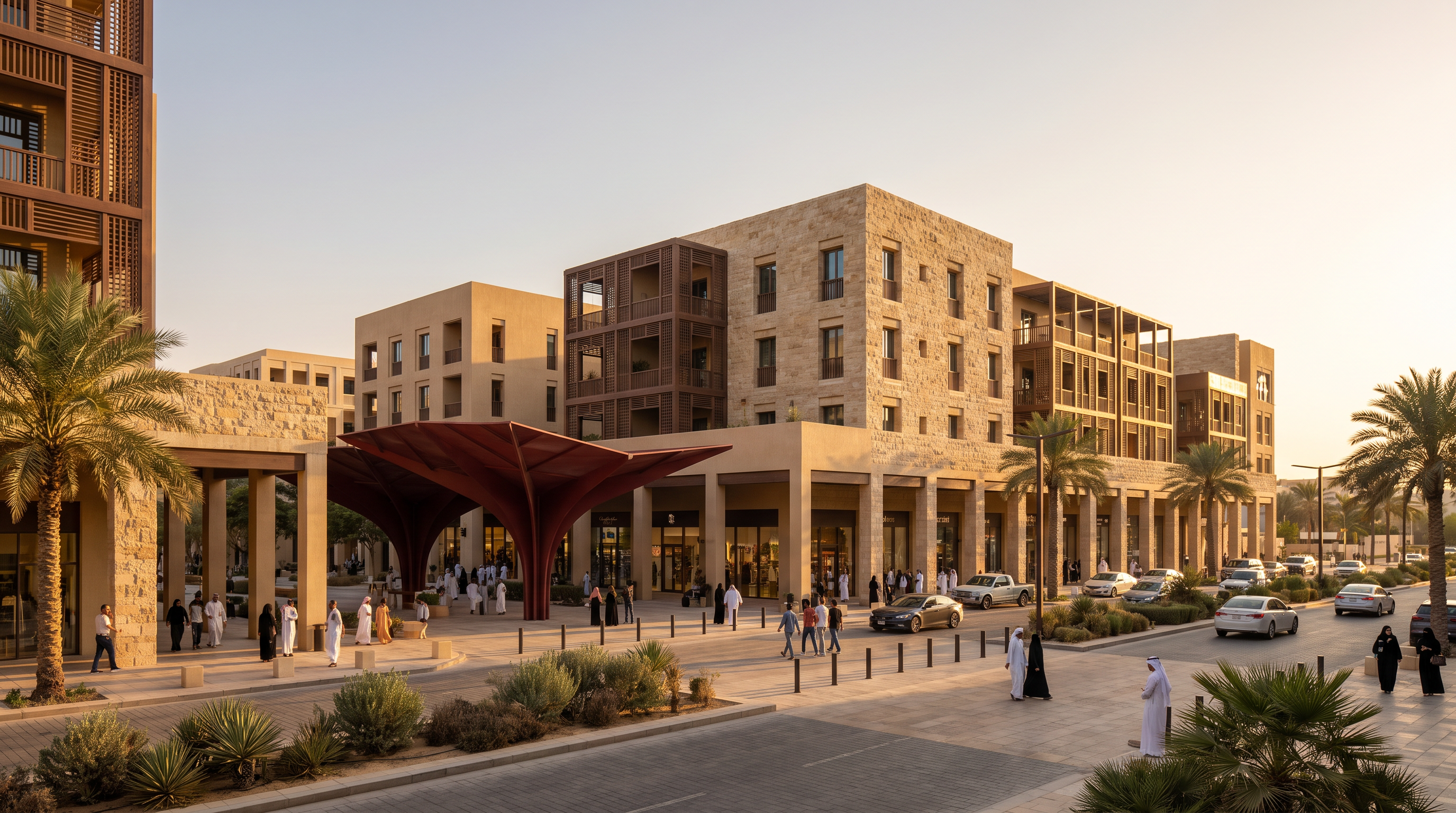
1. Early visualization is a product test, not a polished image
Before a master plan, unit mix or detailed brief is fixed, the developer needs a practical answer: can a person who may pay for this product understand what it is? Early visualization turns feasibility assumptions into a scene that can be examined. It shows whether the mass reads from the street, whether arrival signals the asset’s intended level, how uses relate to one another, and whether the sales team can explain the offer without a long script.
In Saudi Arabia, an investment thesis can look sound in a spreadsheet and become weak when translated into space. “Family residential compound” is not a product definition. The team needs to see gates, parking, balcony privacy, guest movement, street frontage and service locations. If an early view does not reveal why the project is preferable to available alternatives, it has not yet demonstrated marketability, however attractive the rendering may be.
2. What should be tested before the product is frozen?
Use four testable hypotheses: who is the primary buyer or tenant; what moment triggers their choice; what spatial compromise will they accept; and what will cause immediate rejection? Commission views that do more than show an aerial hero image. Show decision moments: approaching the site, entering, reaching a unit, using shared areas, and looking out from inside. These scenes expose gaps that a schedule of areas cannot reveal.
The decision questions should be precise. Does arrival feel orderly and secure? Does the frontage carry the presence expected at the intended price point? Can ground-floor or retail units identify themselves clearly? Can a family use common areas without uncomfortable conflict with visitors or service movement? The objective is not aesthetic consensus. It is evidence that the product removes a foreseeable buying objection or creates a tangible reason to choose it.
3. A practical framework: from market hypothesis to decision board
The work can be organized through three decision boards. The market board identifies the target segment, the alternatives it compares, the intended sale or rental level, and the benefits the customer must see rather than merely read. The place board shows urban context, arrival points, vehicle and pedestrian movement, sensitive edges, sun exposure and privacy. The product board shows unit prototypes, the transition from public to private space, service elements and the views that substantiate the commercial promise.
These boards do not replace real estate product feasibility work in Saudi Arabia; they make its assumptions discussable. Review the first version with investment, development, sales and leasing teams. Require each team to record objections in design language: “the entrance does not communicate the project level” or “retail frontage is not visible from the arrival route,” rather than “it does not feel right.” Then revise the hypothesis, massing or programme and test the next version.
4. Visualization must test the journey, not only the façade
A common mistake is to rely on one elevated image at an ideal sunset. It may support an investment presentation, but it does not test everyday experience. Real estate is judged through a sequence of small moments: where a driver turns, whether a visitor can find the guest entrance, how clearly a resident reaches the front door from parking, what a passer-by sees from the street, and what happens where family movement meets deliveries and maintenance.
For mixed-use schemes, this journey needs more scrutiny. Test separate access for residential, retail and offices where relevant; clear drop-off zones; service loading points; and treatment of edges facing neighbouring plots. A night scene also deserves early attention because it tests legibility, visual comfort and roadside identity, without claiming operational outcomes that cannot be proven before delivery. Honest views that expose friction are more valuable than images designed to conceal it.
5. Mistakes that weaken marketability testing
Do not confuse visual appeal with commercial validation. Premium finishes, excessive landscaping or staged lifestyle scenes can make a product appear stronger than its actual decisions. Do not ask the visualization team to solve an unresolved development question either. If parking strategy, retail quantum or target household profile remains unclear, the image cannot fix it. It will simply postpone the disagreement until a more expensive phase.
Another error is treating a visualization as implied approval. Every review should state what is assumed, what is a provisional decision, and what requires verification by the appropriate advisers. A single perspective should never be read as proof of regulatory compliance, buildability, authority approval or sales performance. At this stage, its job is to make risks and opportunities visible and identify the next question that requires data, design work or technical review.
6. The next step: a short, measured decision cycle
Run a cycle that takes weeks, not months. Define the product hypothesis, prepare five to seven decision scenes, and hold a structured review with decision makers. For every scene, ask three things: what promise does it prove; what objection does it expose; and what change could improve offer clarity or reduce risk? Sort the responses into product changes, design changes, and questions requiring independent market or financial validation.
The required outcome is not “approval of the renders.” It is a clear choice: proceed with the product, revise the customer segment, mix or circulation strategy, or stop the idea before it hardens. When detailed design begins, retain the original decision board as a reference. If the scheme loses the spatial elements that carried its commercial promise during development, the team should see it immediately. Good early visualization connects the sales story to spatial choices that can be delivered and reviewed.